Opportunity: How can a construction collaboration startup make it's new product better and more intuitive?
Summary: As a co-founder, I cared deeply about the BuildersCloud product. And after we got it into the hands of more customers - it became clear there were aspects we could improve upon. Some interactions took too many steps. Other interactions weren't ideal on a touch device - limiting one of our main selling points. Working closely alongside our development team, as well as an external UX/UI designer (Moses Feliz) - we designed a V2 for the main BuildersCloud featureset that would not only simplify common tasks - but would allow us to integrate commonly requested new features.
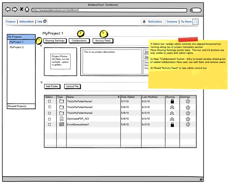
Based upon feedback and interviews with early customers, as well as interviews with potential customers - we knew that the main BuildersCloud functionality needed easier access - especially on touch-screen devices.
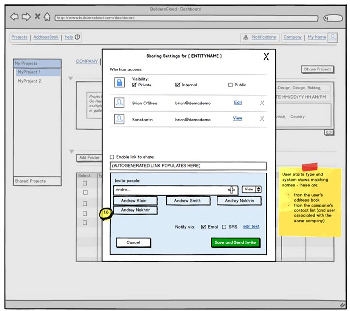
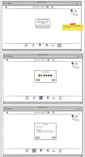
In collaborative meetings between development, design, and product leads - we used lots of whiteboarding to get the concept and flow down. I then took these ideas into Balsamiq to create artifacts that our developers could start to run with. We ran agile - and as I could sit next to our CTO - it was easy to collaborate on the screens as questions came up or new challenges arose. Here are some examples of that process:
Sadly, our efforts on the next evolution of BuildersCloud had limited traction. We began to pivot as development was underway. Some pieces of the effort went live (to positive feedback) but we never did have the chance to push all the new features and designs out the door.