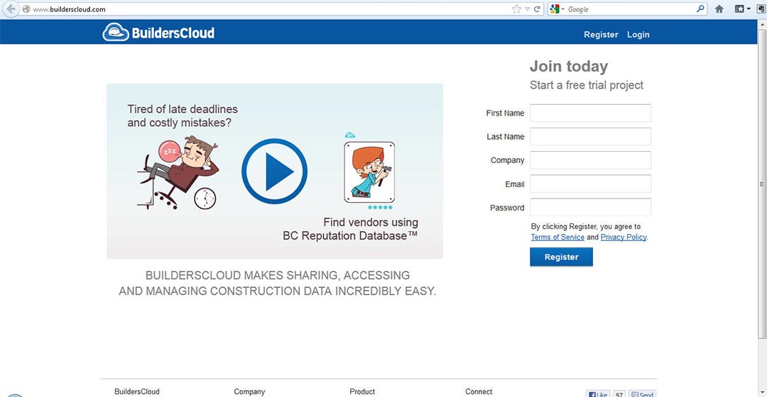
Opportunity: Brought on as a co-founder to lead product for a SAAS construction collaboration tool at BuildersCloud I quickly realized that our website, as a front door - was doing a poor job of relating who we were, what we offered and why anyone should care.
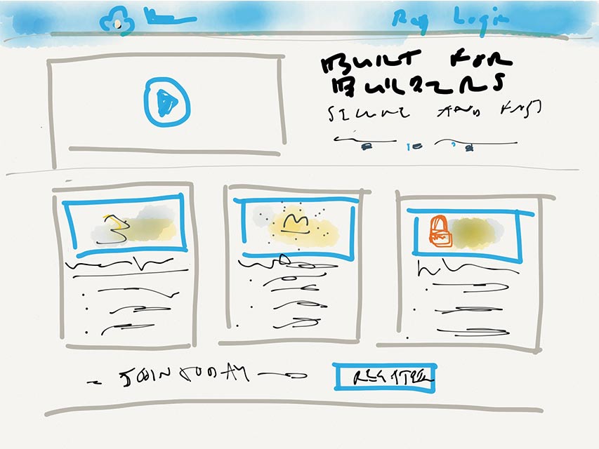
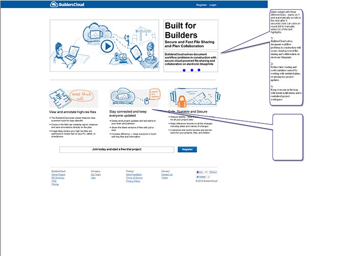
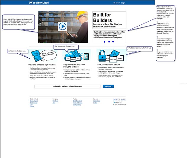
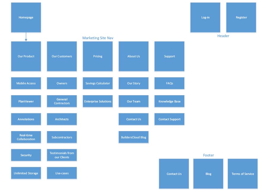
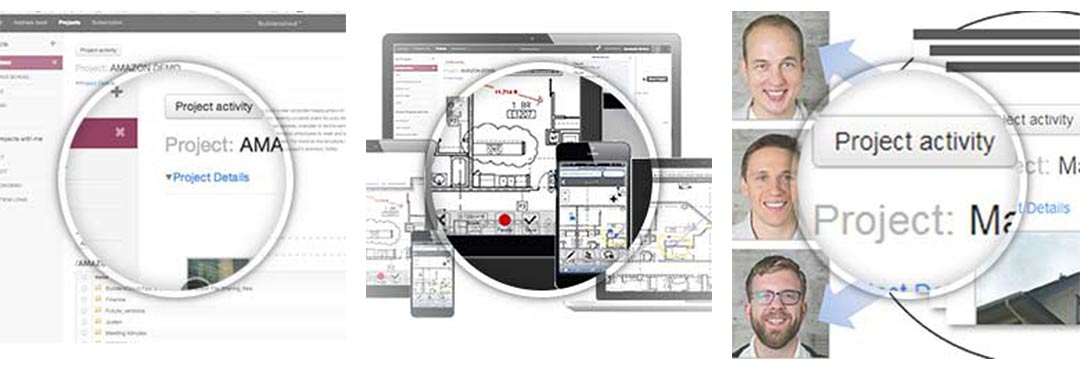
The existing website was a turn off to investors as well, and as we were raising a seed round it was critical that we had a responsive marketing site that showed the dyanmic product and team no matter what device the viewer was using. Furthermore we needed to update site graphics - from a cartoonish theme to something more neutral and professional. In addition - a full array of copy and content would be needed across the entire site - to back up our team, to better explain our offering, and to start to test messaging for conversion potential.
Based upon feedback and interviews with early customers, as well as interviews with potential customers - we knew that the main BuildersCloud functionality needed easier access - especially on touch-screen devices.
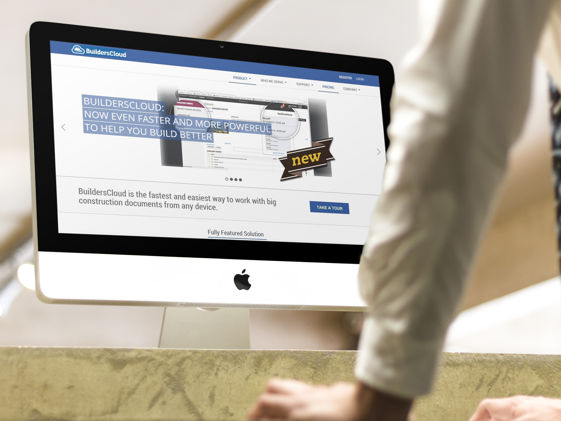
When I was brought in - the BuildersCloud site had already been through an iteration or two - but development resources were focused on the main tools and backend, so the marketing site was neglected. As we entered TechStars, as part of the 2013 Microsoft Azure Accelerator cohort - it was made painfully obvious we needed a refresh ahead of any fundraising round. I got to work:
The new site paid off - we gained a new professional looking front-door, and ultimately closed a sold seed-round of fundraising, as well as new customer activity. And visitors across the board had a much clearer idea of who we were, and what we offered.